13 Weird Movie Details You Might Have Thought Were Accidents
Movies are packed with tiny details that are easy to miss, especially when the story is moving quickly. A strange prop in the background, an unusual costume choice, a character’s odd reaction, or a tiny visual detail can look like a continuity mistake when you first notice it. Sometimes, though, those things were placed there deliberately. Filmmakers love hiding little jokes, clues, references, and visual tricks in places most viewers will never think to look. Once you learn the reason behind some of these choices, they become much harder to unsee. Here are some wonderfully strange details that were absolutely intentional.
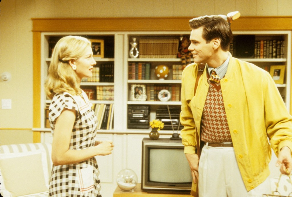
The Truman Show (1998)
The strange brand names throughout Truman’s world, including Mococoa and Chef’s Pal, were deliberately created as exaggerated examples of product placement inside the artificial reality surrounding him.
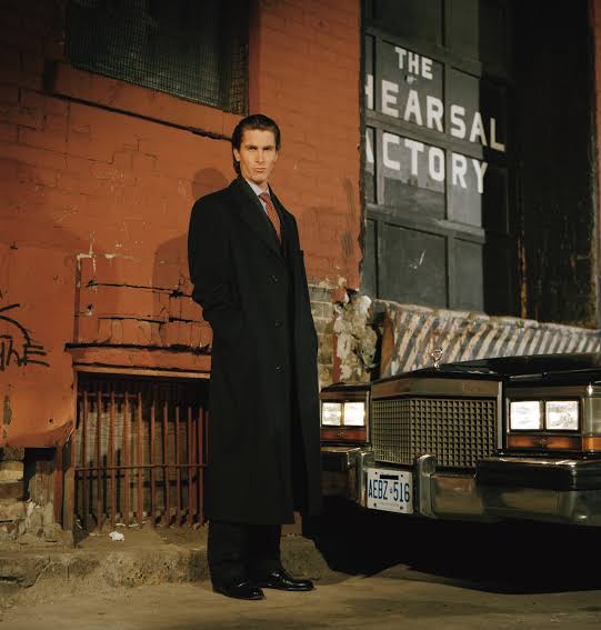
American Psycho (2000)
Patrick Bateman’s business card obsession was deliberately filmed as a tiny status battle, with the almost identical cards becoming increasingly ridiculous as each character tries to impress the others.
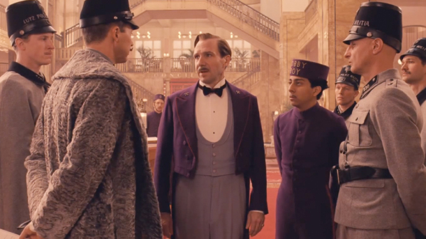
The Grand Budapest Hotel (2014)
The movie switches between several aspect ratios depending on the time period being shown, a deliberate visual choice that helps distinguish each historical era.
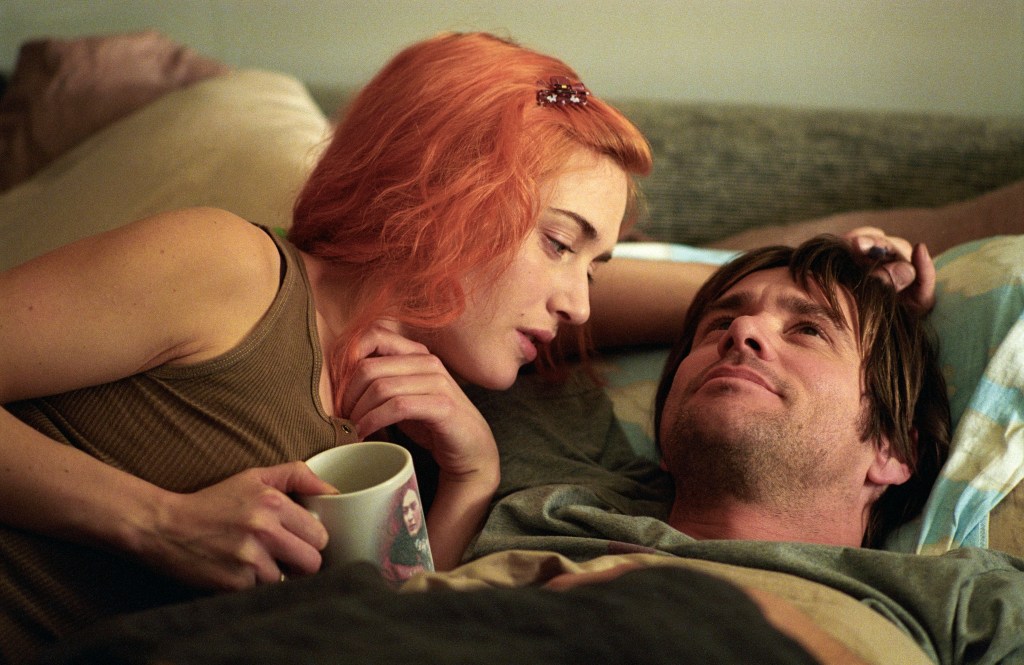
Eternal Sunshine of the Spotless Mind (2004)
The disappearing environments around Joel were created using practical effects and in camera tricks, including sets that physically moved or were manipulated while Jim Carrey remained inside them.
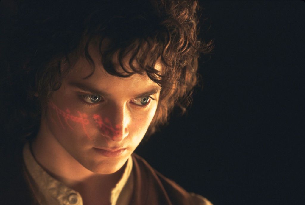
The Lord of the Rings: The Fellowship of the Ring (2001)
The different apparent sizes of the hobbits and other characters were achieved using forced perspective, specially constructed sets, and carefully positioned doubles rather than relying entirely on digital effects.
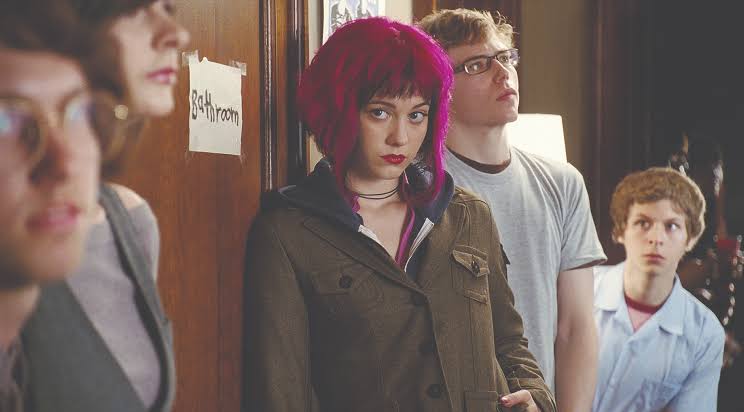
Scott Pilgrim vs. the World (2010)
The movie deliberately uses video game style sound effects for ordinary actions, turning punches, footsteps, and other movements into part of its comic book inspired visual language.
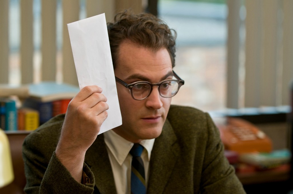
A Serious Man (2009)
The Hebrew letters and mathematical symbols appearing around Larry’s life are part of the Coen brothers’ deliberate visual design, reinforcing the movie’s themes of uncertainty and interpretation.
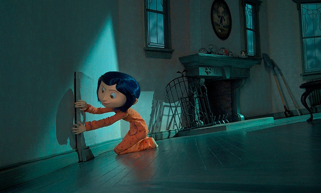
Coraline (2009)
The tiny world inside the alternate apartment was built with enormous attention to detail, including subtle changes in food, clothing, and decorations that make the alternate reality increasingly unsettling.
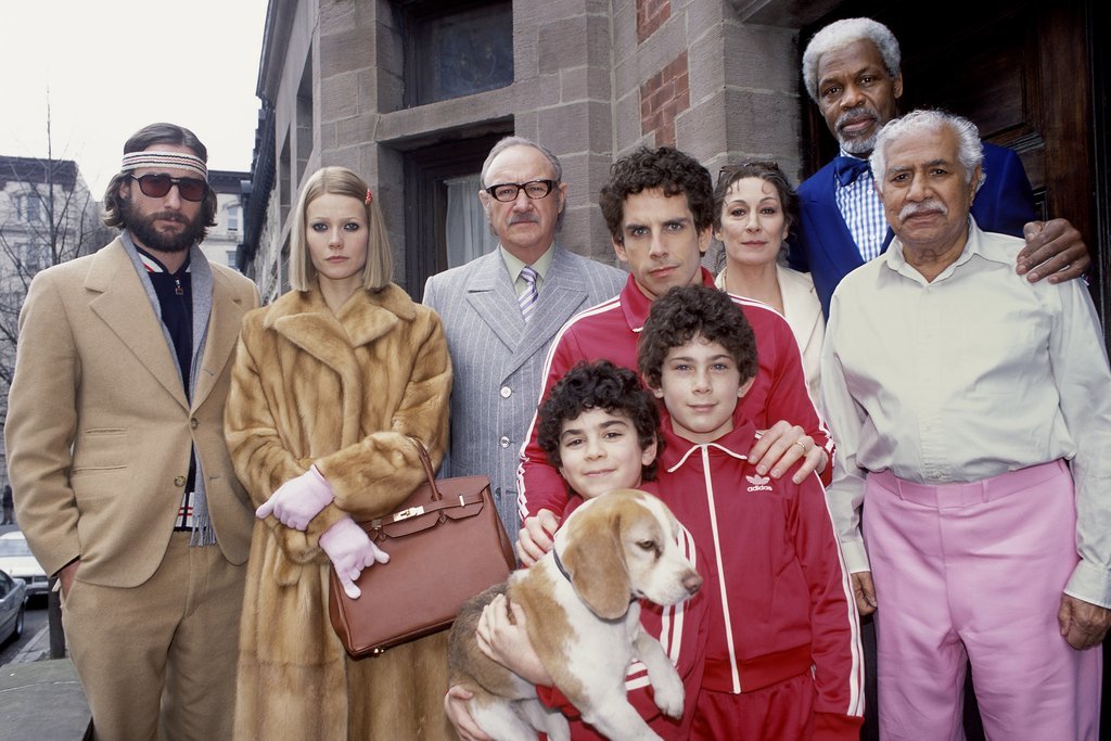
The Royal Tenenbaums (2001)
Many characters wear essentially the same outfits throughout the movie because their costumes were designed to show that they remain psychologically trapped in the periods when they were happiest.

Get Out (2017)
The teacup used by Missy Armitage is not simply a random household object, since its repeated appearance becomes closely tied to the method she uses to hypnotize Chris.
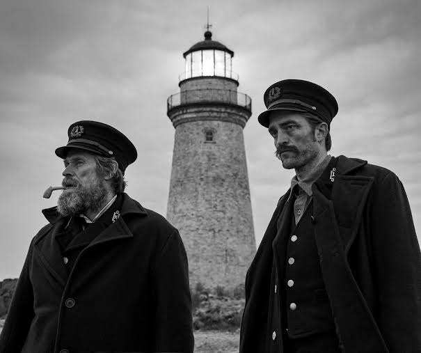
The Lighthouse (2019)
The movie was shot in an unusually narrow aspect ratio inspired by older filmmaking formats, deliberately making the lighthouse and surrounding environment feel cramped and oppressive.
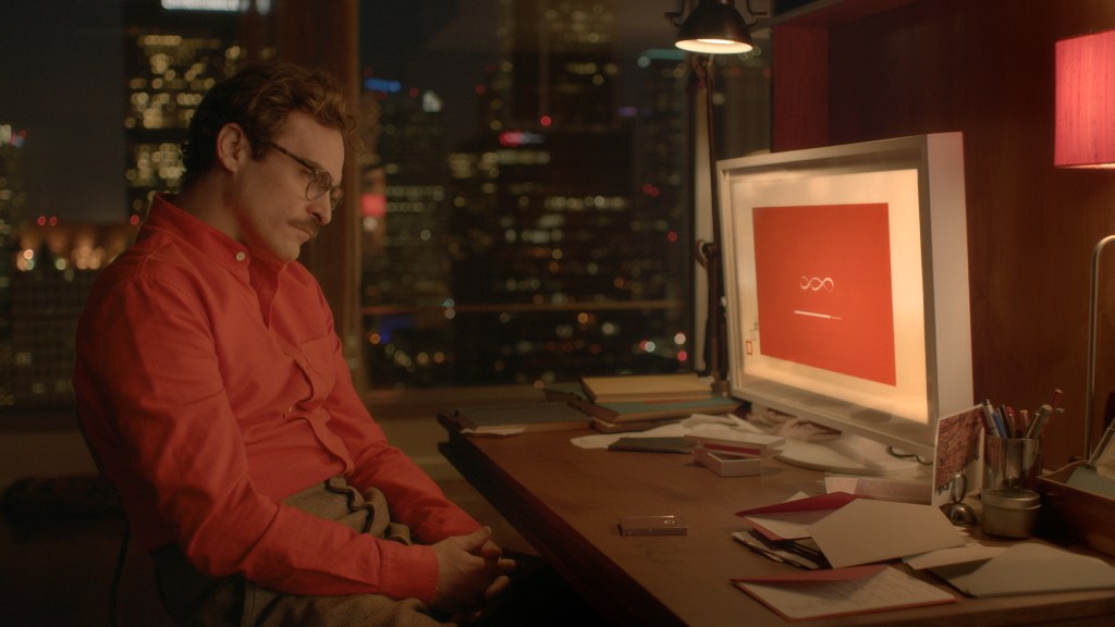
Her (2013)
The movie’s deliberately soft color palette and absence of blue in many scenes were carefully designed to create a warm, slightly unreal version of Los Angeles that matches Theodore’s emotional state.
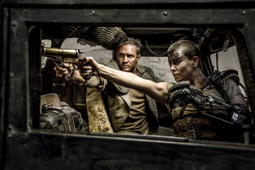
Mad Max: Fury Road (2015)
The product placements are sometimes delivered directly to Truman by people around him in absurdly unnatural ways, intentionally parodying the way television advertising can interrupt a story.
The post 13 Weird Movie Details You Might Have Thought Were Accidents appeared first on Den of Geek.
Leave a Reply
You must be logged in to post a comment.